แพ็กเกจ
อีสปริง แคร์ 3 ปี
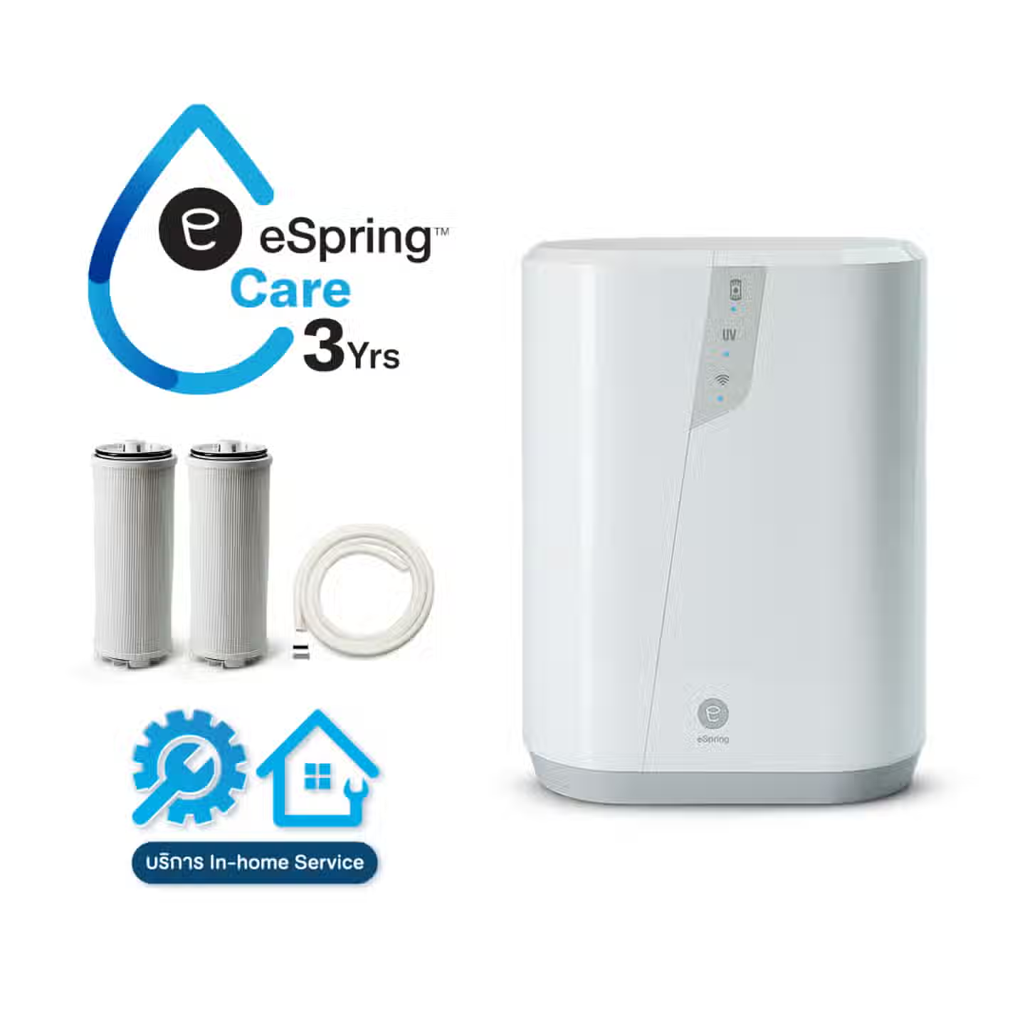
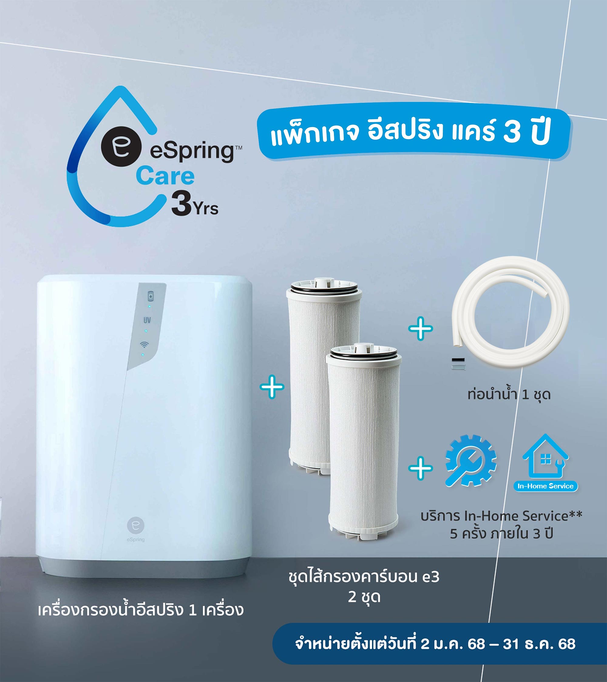
แพ็กเกจที่ประกอบด้วย เครื่องกรองน้ำ อีสปริง 1 เครื่อง พร้อมชุดไส้กรองคาร์บอน e3 อีก 2 ชิ้น และท่อนำน้ำ อีก 1 ชิ้น รวมบริการ In-Home Service** 5 ครั้ง ภายใน 3 ปี ที่รวมถึงบริการติดตั้งในครั้งแรก* บริการล้างทำความสะอาดเครื่องและหัวเบี่ยง เปลี่ยนไส้กรองและท่อนำน้ำ ตรวจเช็กอาการและเปลี่ยนอะไหล่ (ถ้ามี)
แพ็กเกจ อีสปริง แคร์ 3 ปี
ประกอบด้วย
- เครื่องกรองน้ำ อีสปริง 1 เครื่อง
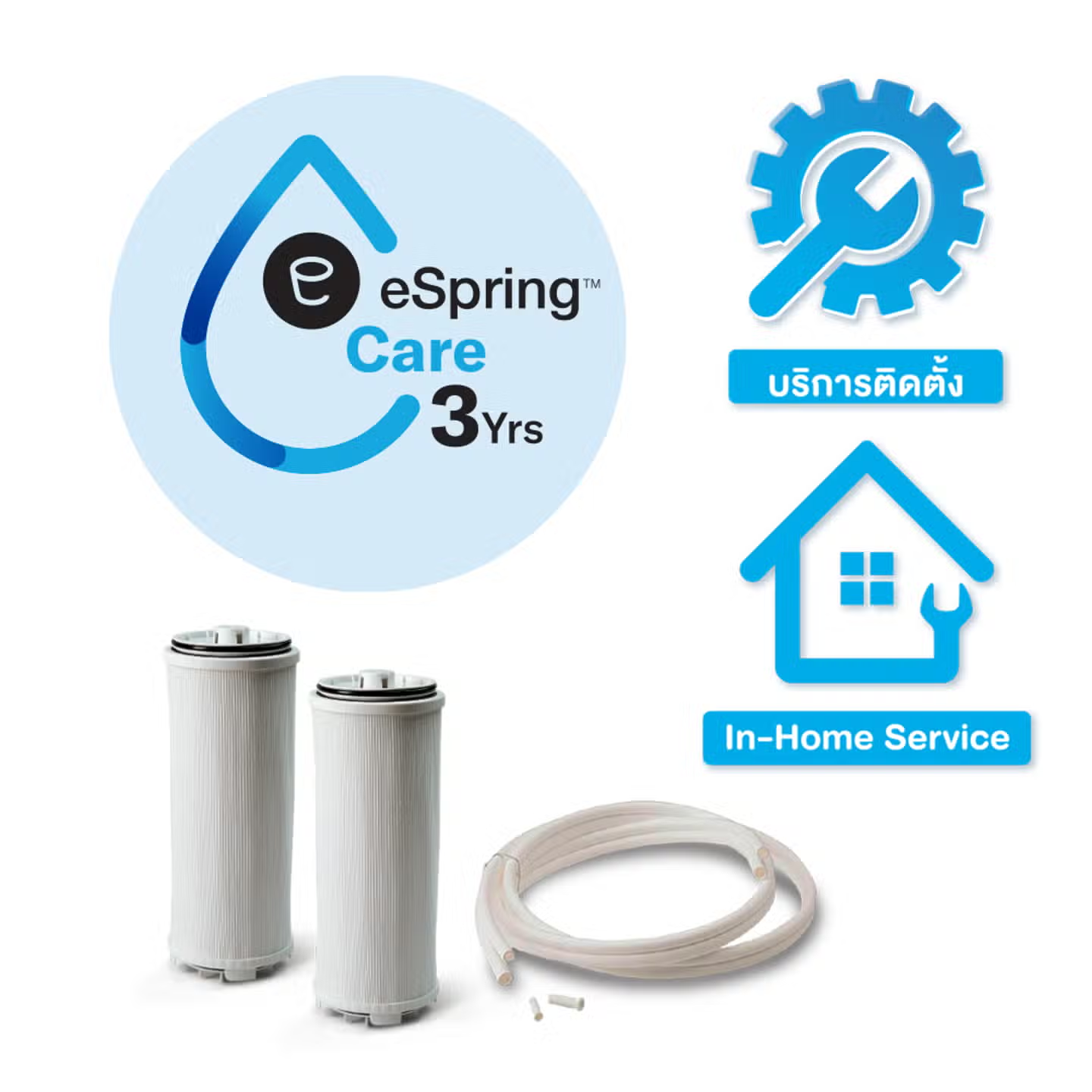
- ชุดไส้กรองคาร์บอน e3 อีก 2 ชิ้น
- ท่อนำน้ำ อีก 1 ชิ้น
- บริการ In-Home Service** 5 ครั้ง ภายใน 3 ปี นับจากวันที่ซื้อหรือรับสินค้า
- บริการติดตั้งในครั้งแรก*
- บริการล้างทำความสะอาดเครื่องและหัวเบี่ยงทิศทางน้ำ
- เปลี่ยนไส้กรองและ/หรือท่อนำน้ำ
- ตรวจเช็กอาการและเปลี่ยนอะไหล่ (ถ้ามี)
พร้อมผ่อนชำระ
0%
นาน 10/18/24/36 เดือน***
กับบัตรเครดิตที่ร่วมรายการ
* อาจมีค่าใช้จ่ายเพิ่มเติมขึ้นอยู่กับวิธีการติดตั้งเครื่องและความพร้อมของพื้นที่ติดตั้ง ดังนี้ • ในกรณีที่ติดตั้งบนเคาน์เตอร์ (หัวต่อเบี่ยงทิศทางน้ำ) บริการติดตั้งฟรี! • ในกรณีที่ติดตั้งแบบใต้ซิงค์พร้อมก๊อกน้ำอีสปริง ลูกค้าต้องสั่งซื้อชุดอุปกรณ์ติดตั้งใต้ซิงค์พร้อมก๊อกน้ำอีสปริง และมีค่าใช้จ่ายในการติดตั้งเพิ่มเติม ดังนี้ 1. ติดตั้งใต้ซิงค์แบบไม่เจาะ พร้อมวาล์วสแตนเลสเปิด-ปิด 2 ทาง มีค่าใช้จ่ายเพิ่มเติม 200 บาท 2. ติดตั้งใต้ซิงค์แบบเจาะ พร้อมวาล์วสแตนเลสเปิด-ปิด 2 ทาง มีค่าใช้จ่ายเพิ่มเติม 350 บาท • ในกรณีที่มีการติดตั้งปลั๊กไฟใต้ซิงค์ (พร้อมเต้าปลั๊ก 1 ชุด และสายไฟไม่เกิน 5 เมตร หากเกิน 5 เมตร มีค่าใช้จ่ายเพิ่มเติม เมตรละ 50 บาท) มีค่าใช้จ่ายเพิ่มเติม 800 บาท • ในกรณีที่ติดตั้งเครื่องกรองน้ำแบบเจาะยึดกับผนัง มีค่าใช้จ่ายเพิ่มเติม 200 บาท โดยลูกค้าต้องสั่งซื้อชุดอุปกรณ์ติดตั้งฝาผนังก่อนการติดตั้ง
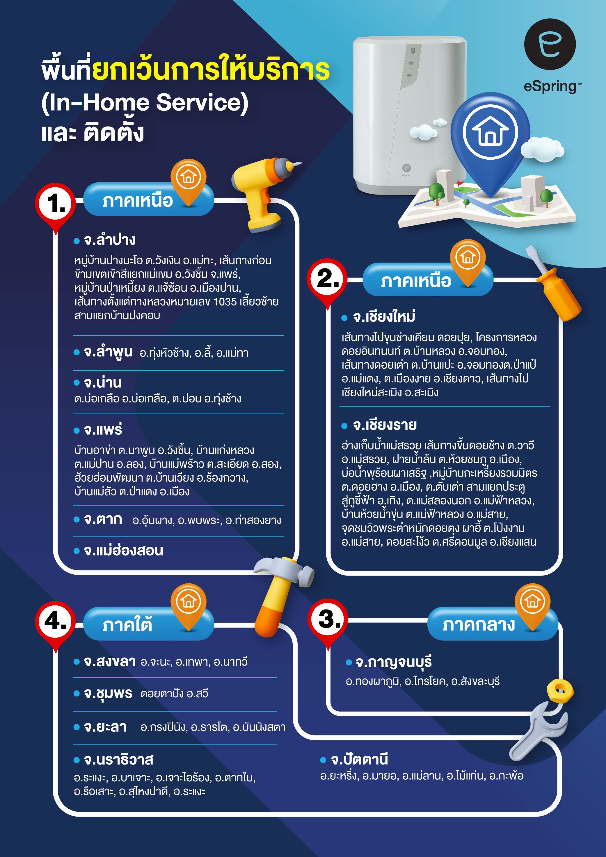
** พื้นที่ให้บริการถึงบ้าน (In-home Service) • ในพื้นที่กรุงเทพมหานครและปริมณฑล บริการฟรี! • ในพื้นที่ต่างจังหวัด ฟรี! ค่าเดินทางในรัศมี 30 กิโลเมตร จากแอมเวย์ ช็อป ทุกสาขา หากเกิน 30 กิโลเมตร มีค่าใช้จ่ายเพิ่มเติมคิดเป็นกิโลเมตรละ 12 บาท (นับจากกิโลเมตรที่ 30 เป็นต้นไป) • ไม่ครอบคลุมพื้นที่ดังต่อไปนี้ คลิก >
หมายเหตุ: • แพ็กเกจ อีสปริง แคร์ 3 ปี ให้บริการเฉพาะเลขหมายประจำเครื่อง (Serial Number) ของเครื่องกรองน้ำ อีสปริง ที่ซื้อครั้งแรกเท่านั้น ไม่สามารถเปลี่ยนเครื่องได้ • เครื่องกรองน้ำ อีสปริง พร้อมแพ็กเกจ อีสปริง แคร์ รับประกันความพอใจ 90 วันนับจากวันรับสินค้า • กรณีใช้บริการติดตั้งที่บ้านแล้วและต้องการคืนเครื่องพร้อมแพ็กเกจตามเงื่อนไขการรับประกันความพอใจ ลูกค้าจะต้องชำระค่าติดตั้งคืนให้กับบริษัท ก่อนทำการคืนสินค้า • สอบถามข้อมูลเพิ่มเติม ติดต่อแผนกบริการหลังการขาย หรือ Amway Contact Center 0-2725-8000
eSpring Drink BETTER
Drink HEALTHIER
/* PDP */ #our-company { width: 100%; } #our-company .facility-hq-list { width: 1180px; margin: 0 auto; } #amway-global-accordion { max-width: 100%; } @media only screen and (max-width: 1180px) { #our-company .facility-hq-list { width: 100%; } } .content-block [class*="col-"] { padding-left: 0; padding-right: 0; } .content-block [class*="row"] { margin-left: 0; margin-right: 0; } @media only screen and (max-width: 1180px) { .content-block .cb-section > .row { margin-left: 0; margin-right: 0; } } @media only screen and (max-width: 992px) { } /* LP */ /* Default width and Header modification */ div#our-company, .main-container { width: 100% !important; padding: 0 !important; margin: 0 !important; max-width: 100vw !important; } #amway-global-accordion { width: 100%; margin: 0 auto !important; max-width: 100vw !important; overflow-x: hidden; } #our-company .facility-hq-list { width: 100% !important; margin: 0 auto !important; display: block; } .product-list-page-title { font-family: 'Sukhumvit Tadmai', 'Noto Sans Thai', sans-serif !important; text-transform: capitalize; width: 1180px; margin: 0 auto 25px auto !important; } @media only screen and (max-width: 1180px) { .product-list-page-title { width: 94%; } } @media only screen and (max-width: 992px) { .product-list-page-title { line-height: 36px; } } .breadcrumb-section { width: 1180px; margin: 0 auto; } .breadcrumb-section li, .breadcrumb-section li a { font-family: 'Sukhumvit Tadmai', 'Noto Sans Thai', sans-serif; } @media only screen and (max-width: 1180px) { .breadcrumb-section { width: 94%; } } @media only screen and (max-width: 1023px) { .mobile-breadcrumb-pad { padding-left: 0 !important; } } /* GLOBAL */ br.dl-br { display: block; } br.d-br, .d-br br { display: block; } br.t-br { display: none; } br.m-br, .m-br br { display: none; } .img-d { display: block !important; } .img-m { display: none !important; } @media only screen and (max-width: 768px) { br.dl-br { display: none; } br.t-br { display: block; } } @media only screen and (max-width: 660px) { .img-d { display: none !important; } .img-m { display: block !important; } br.d-br, .d-br br { display: none; } br.m-br, .m-br br { display: block; } br.t-br { display: none; } } @media only screen and (max-width: 340px) { .xs-nobr br { display: none; } } /* COLUMN WIDTH */ .content-width-40 { margin: 0 auto; width: 40%; } .content-width-70 { margin: 0 auto; width: 70%; } .content-width-60 { margin: 0 auto; width: 60%; } .content-width-80 { margin: 0 auto; width: 80%; } .content-width-85 { width: 85%; margin: 0 auto; } .content-width-90 { margin: 0 auto; width: 90%; } .content-width-100 { margin: 0 auto; } @media only screen and (max-width: 1180px) { .content-width-60 { width: 80%; } .content-width-90 { width: 100%; } } @media only screen and (max-width: 1023px) { .amway-dt-accordion { padding-left: 0; padding-right: 0; } .amway-dt-accordion-title { padding-left: 1.5rem; padding-right: 1.5rem; } .content-width-100 { padding-left: 15px; padding-right: 15px; } } @media only screen and (max-width: 994px) { .content-width-85 { width: 100%; } .content-width-70 { width: 100%; } } @media only screen and (max-width: 768px) { .content-width-60 { width: 100%; } .content-width-40, .content-width-60, .content-width-90 { padding-left: 15px; padding-right: 15px; } } @media only screen and (max-width: 660px) { } .content-block, .main-content-style, .content-block a, .content-block h1, .content-block h2, .content-block h3, .content-block h4, .content-block h5, .content-block h6 { font-family: 'Sukhumvit Tadmai', 'Noto Sans Thai', sans-serif; -webkit-font-smoothing: antialiased; color: #2C2C2C; text-transform: inherit; } .content-block img { width: 100%; max-width: 100%; display: block; } .content-block { margin-bottom: 40px; } /* Content Style */ .main-content-style h1 { font-size: 30px; line-height: 38px; } .main-content-style h2 { font-size: 24px; line-height: 32px; margin: 0 0 10px 0; } .main-content-style h3 { font-size: 22px; line-height: 30px; color: #2c2c2c; margin: 0 0 10px 0; } .main-content-style h4 { font-size: 20px; line-height: 28px; color: #2c2c2c; margin: 0 0 10px 0; } .main-content-style p { font-size: 18px; line-height: 28px; margin: 0 0 10px 0; } .main-content-style ul, .main-content-style ol { margin: 0 0 10px 0; padding-left: 22px; } .main-content-style ul li { display: list-item; list-style: disc; font-size: 18px; line-height: 28px; margin: 0 0 10px 0; } .main-content-style ol li { display: list-item; list-style: decimal; font-size: 18px; line-height: 28px; margin: 0 0 10px 0; } .main-content-style img { display: block; margin: 0 0 10px 0; } .main-content-style table { width: 100%; margin-bottom: 20px; border: 1px solid #ddd; border-top: none; border-collapse: collapse; border-spacing: 0; } .main-content-style table tr { } .main-content-style table td, .main-content-style table th { padding: 10px; font-size: 18px; line-height: 26px; vertical-align: top; } .main-content-style .item-video { position: relative; padding-bottom: 56.25%; overflow: hidden; } .main-content-style iframe, .main-content-style object, .main-content-style embed { position: absolute; top: 0; left: 0; width: 100%; max-width: 100% !important; height: 100%; border-radius: 20px; } .video-banner { } .block-video { position: relative; } .block-video video { width: 100%; display: block; border-radius: 20px; } .block-video .btn-view-video { /* background: url(XXX) center no-repeat;*/ background-size: 70px; width: 100px; height: 100px; position: absolute; bottom: 1%; right: 2%; z-index: 15; } .block-video .btn-view-video:hover { opacity: 1; } .block-video .bg-video { display: none; } .block-video .bg-video img { width: 100%; max-width: 100%; margin: 0; border-radius: 20px; } @media only screen and (max-width: 1024px) { .block-video { padding: 0; } .block-video .bg-video { } .block-video video { } .block-video .btn-view-video { background-size: 60px; width: 80px; height: 80px; } } @media only screen and (max-width: 768px) { .block-video .btn-view-video { display: block; } } @media only screen and (max-width: 660px) { .block-video .btn-view-video { background-size: 50px; width: 60px; height: 60px; } .block-video .bg-video img { border-radius: 0; } } /* Text Style */ .main-content-style .txt-ref, .txt-ref, .txt-remark { font-size: 14px !important; line-height: 22px !important; } /* List Style */ ul.list-s1 { counter-reset: list2; } ul.list-s1 li { list-style: none !important; position: relative; text-align: left; margin-bottom: 5px; } ul.list-s1 li:before { content: counter(list2); content: ""; position: absolute; width: 8px; height: 8px; border-radius: 50%; background: #C05481; left: -22px; top: 11px; } /* LAYOUT */ .cb-section { padding: 40px 0; position: relative; width: 1180px; max-width: 100%; height: 100%; margin: 0 auto; } .cb-sectioin-fullwidth { padding: 40px 0; position: relative; width: 100%; height: 100%; } @media only screen and (max-width: 1180px) { /* For Testing page ONLY!, REMOVE on PDP Page */ /*.cb-section { width: 100%; padding-left: 1.5rem; padding-right: 1.5rem; }*/ .cb-section { width: 100%; padding-left: 1.5rem; padding-right: 1.5rem; } } @media only screen and (max-width: 1023px) { } @media only screen and (max-width: 660px) { .cb-section { padding: 1.5rem; } } /* Sections */ .cb-section-s1 { padding: 0; position: relative; background: #45535e; padding-bottom: 40px; } .cb-section-s1 .content-1 { text-align: center; position: relative; } .cb-section-s1 .content-1 img { margin: 0; } .cb-section-s1 .content-2 { text-align: center; padding: 0 30px; margin-top: 30px; } .cb-section-s1 .content-2 h1 { color: #03A6E1; margin-bottom: 15px; } .cb-section-s1 .content-2 p { color: #fff; } @media only screen and (max-width: 1180px) { .cb-section-s1 .content-2 { padding: 0 1.5rem; } } @media only screen and (max-width: 768px) { } @media only screen and (max-width: 660px) { } .cb-section-s2 {} @media only screen and (max-width: 1180px) { .cb-section-s2 { padding-left: 0; padding-right: 0; } } @media only screen and (max-width: 1024px) { .cb-section-s2 { padding: 1.5rem; } } .cb-section-s3 { background: #0094C9; } .cb-section-s3 .cb-section { padding: 0; } .cb-section-s3 .content-1 { padding: 0 30px; } .cb-section-s3 .content-1 p { font-size: 14px; line-height: 21px; color: #fff; } .cb-section-s3 .content-1 p a { color: #fff; } @media only screen and (max-width: 1180px) { .cb-section-s3 .content-1 { padding: 0; } } .cb-section-s5 { background: #094977; padding-left: 30px; padding-right: 30px; } .cb-section-s5 .content-1 { text-align: center; } .cb-section-s5 .content-1 h2 { color: #fff; } .cb-section-s5 .content-2 { margin-top: 30px; } @media only screen and (max-width: 1180px) { .cb-section-s5 { padding: 1.5rem; } } .cb-section-s10 { padding-top: 0; background: linear-gradient(50deg, #00a7e1 43%, #094977 43.1%); } .cb-section-s10:after { content: ""; width: 100%; height: 70px; background: linear-gradient(-358.7deg, #fff 54%, transparent 54.3%); position: absolute; z-index: 20; left: 0; bottom: 0; } .cb-section-s10 .cb-section { padding-top: 0; } .cb-section-s10 .content-1 { padding: 20px 0 30px 0; background: linear-gradient(120deg, #00a7e1 36%, #094977 36.1%); } .cb-section-s10 .content-1 p { font-size: 24px; line-height: 32px; font-weight: 600; color: #fff; margin: 0; } .cb-section-s10 .content-1 span { margin-right: 5%; margin-left: 26%; } @media only screen and (max-width: 1180px) { .cb-section-s10 .content-1 p span { } } @media only screen and (max-width: 768px) { .cb-section-s10 .content-1 { padding: 10px 0 20px 0; background: linear-gradient(120deg, #00a7e1 40%, #094977 40.1%); } } @media only screen and (max-width: 660px) { .cb-section-s10 { background: linear-gradient(178deg, #00a7e1 32%, #094977 32.3%); } .cb-section-s10:after { height: 60px; background: linear-gradient(-356deg, #fff 54%, transparent 54.5%); } .cb-section-s10 .content-1 { text-align: center; padding-top: 10px; padding-bottom: 30px; background: none; } .cb-section-s10 .content-1 p span { width: 100%; display: block; margin: 0 0 20px 0; } } /* Section Padding */ @media only screen and (max-width: 1180px) { .cb-section-s1 { padding-left: 0; padding-right: 0; } } @media only screen and (max-width: 1023px) { } @media only screen and (max-width: 992px) { } /* Grid Style */ .grid-break { flex-basis: 100%; width: 0; } .grid-s1 { display: flex; flex-flow: row wrap; margin-left: -10px; margin-right: -10px; } .grid-s1 .item { padding: 0 10px; display: flex; } .grid-s1 .item-1 { width: 60%; } .grid-s1 .item-2 { width: 40%; text-align: center; } .grid-s1 .item-inner { width: 100%; height: 100%; padding: 30px; background: #D6F1FA; border-radius: 20px; } .grid-s1 .item img { margin: 0; } .grid-s1 .item li { margin-bottom: 5px; } .grid-s1 .item-1 h2 { color: #094977; } .grid-s1 .item-1 ul { margin-bottom: 0; } .grid-s1 .item-1 ul li { position: relative; padding-left: 3px; } .grid-s1 .item-1 ul li:before { content: ""; background: url(https://media.amway.id/sys-master/images/he7/h03/10914973384734/ath-espring-care-3years-img03-mar2024.png) center no-repeat; background-size: 100%; width: 16px; height: 30px; position: absolute; top: 0; left: -22px; } .grid-s1 .item-1 ul li ul li:before { display: none; } .grid-s1 .item-1 ul li ul { margin-top: 5px; } .grid-s1 .item-1 ul li:last-of-type { margin-bottom: 0; } .grid-s1 .item-2 .item-inner { display: flex; flex-direction: column; justify-content: center; } .grid-s1 .item-2 h3 { color: #094977; } .grid-s1 .item-2 h3 span { font-size: 44px; color: #D10000; display: inline-block; margin-left: 10px; } .grid-s1 .item-2 .txt-s1 { color: #094977; margin-bottom: 0; } .grid-s1 .item-2 .txt-s2 { font-size: 16px; margin-bottom: 0; } .grid-s1 .item-2 .item-img { margin-top: 20px; } .grid-s1 .item-2 .item-img img { width: 80%; margin: 0 auto; } @media only screen and (max-width: 768px) { } @media only screen and (max-width: 660px) { .grid-s1 .item { width: 100%; margin-bottom: 20px; } .grid-s1 .item:nth-last-child(1) { margin-bottom: 0; } .grid-s1 .item-inner { padding: 20px; } .grid-s1 .item h2 { text-align: center; } .grid-s1 .item-2 h3 span { margin-top: 15px; } .grid-s1 .item-2 .item-img img { width: 100%; } } .grid-s2 { display: flex; flex-flow: row wrap; justify-content: center; align-items: flex-end; margin-left: -10px; margin-right: -10px; } .grid-s2 .item { width: 33.33333%; padding: 0 10px; } .grid-s2 .item img { margin: 0; } .grid-s2 .item a { display: block; overflow: hidden; } .grid-s2 .item a img { -webkit-transition: all .2s ease-in-out; -moz-transition: all .2s ease-in-out; -ms-transition: all .2s ease-in-out; -o-transition: all .2s ease-in-out; transition: all .2s ease-in-out; } .grid-s2 .item a:hover img { transform: scale(1.02) translate(0.5%,0.5%); -webkit-transition: all .2s ease-in-out; -moz-transition: all .2s ease-in-out; -ms-transition: all .2s ease-in-out; -o-transition: all .2s ease-in-out; transition: all .2s ease-in-out; } @media only screen and (max-width: 660px) { .grid-s2 .item { width: 100%; margin-bottom: 20px; } .grid-s2 .item:nth-last-child(1) { margin-bottom: 0; } } /**************************** Related Content *****************************/ .cb-section-related-content { padding-top: 40px; } .cb-section-related-content .title { font-size: 30px; line-height: 38px; font-weight: bold; text-align: center; } .cb-section-related-content .btn-viewmore { font-size: 18px; font-weight: bold; color: #fff; text-align: center; padding: 10px; display: block; margin: 40px auto 0 auto; background: #2C2C2C; border-radius: 50px; width: 300px; max-width: 100%; } .cb-section-related-content .btn-viewmore:hover { background: #000; } .grid-related-content { margin-top: 30px; display: flex; flex-flow: row wrap; justify-content: center; margin-left: -10px; margin-right: -10px; } .grid-related-content .item { width: 33.3333333%; padding: 0 10px; } .grid-related-content .item-inner { width: 100%; height: 100%; border-radius: 15px; box-shadow: 0 3px 6px rgba(0,0,0,.16); display: flex; flex-direction: column; } .grid-related-content .item-img { } .grid-related-content .item-img img { border-top-left-radius: 15px; border-top-right-radius: 15px; } .grid-related-content .item-content { text-align: center; padding: 15px; display: flex; flex-direction: column; align-items: center; justify-content: space-between; height: 100%; } .grid-related-content .item-content h2, .grid-related-content .item-content h3 { font-size: 20px; line-height: 28px; font-weight: bold; margin: 0; } .grid-related-content .item-content a { font-weight: bold; padding: 8px; display: inline-block; margin-top: 50px; border: 2px solid #2C2C2C; border-radius: 50px; width: 170px; max-width: 80%; } .grid-related-content .item-content a:hover { color: #fff; background: #2C2C2C; } @media only screen and (max-width: 660px) { .grid-related-content .item { width: 100%; margin-bottom: 20px; } .grid-related-content .item:nth-last-child(1) { margin-bottom: 0; } }

